Celebrating Heritage, Embracing Innovation
Brand Device Revamp
Icon and Style Design
Design Concept & Visual Identity
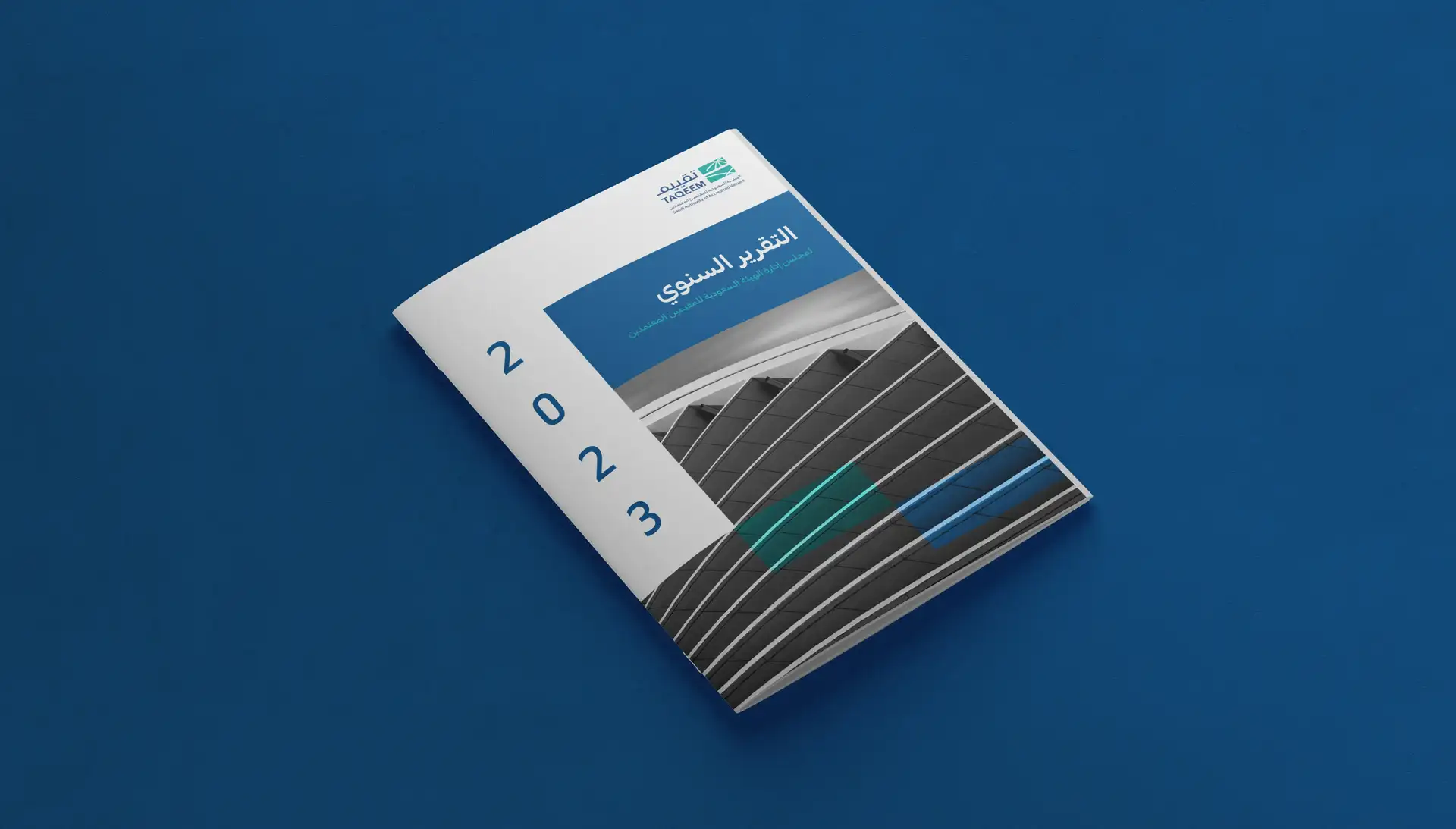
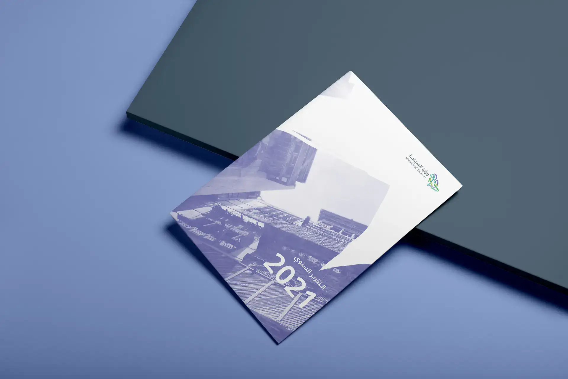
This annual report balances Saudi heritage with modern design, reflecting the Ministry of Tourism’s commitment to honoring the past while shaping a vibrant future. The overall look introduces a fresh color palette—cool blues, purples, and greens—to mirror the Kingdom’s rich natural landscapes and diverse cultural heritage.
Photography & Cultural Motifs
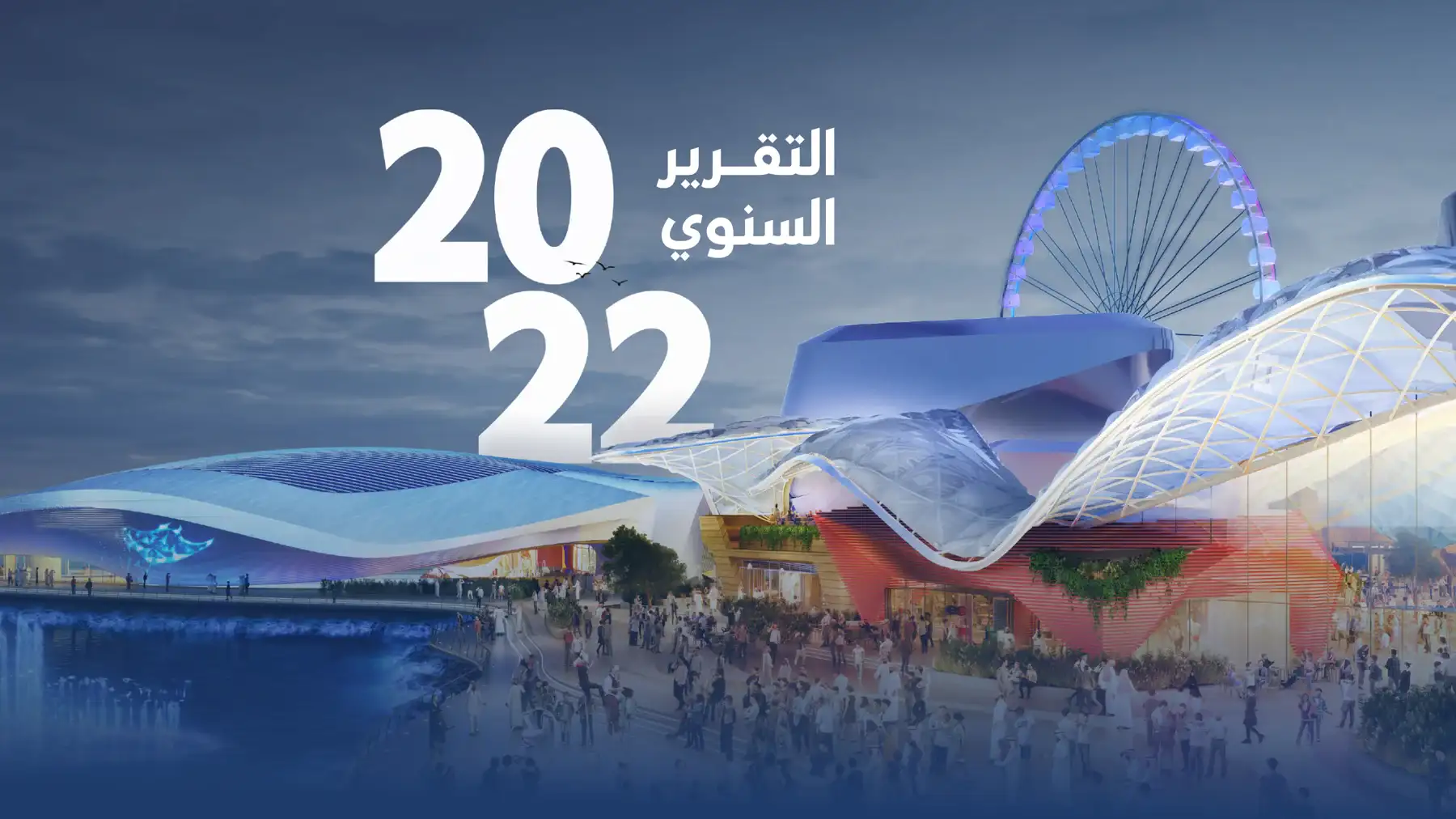
Carefully curated photography showcases iconic Saudi landmarks, local architecture, and scenic vistas, visually illustrating the Ministry’s commitment to protecting cultural treasures and encouraging tourism growth. Subtle heritage-inspired shapes—such as the brush device—are layered over images to give depth and harmony, seamlessly blending the nation’s story with contemporary design.
Brush
The Brush Device as a Signature Element
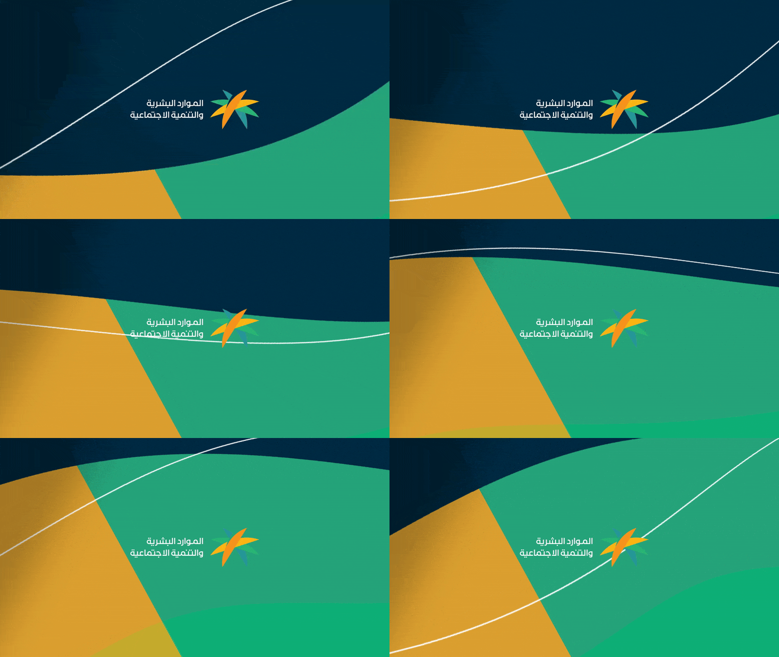
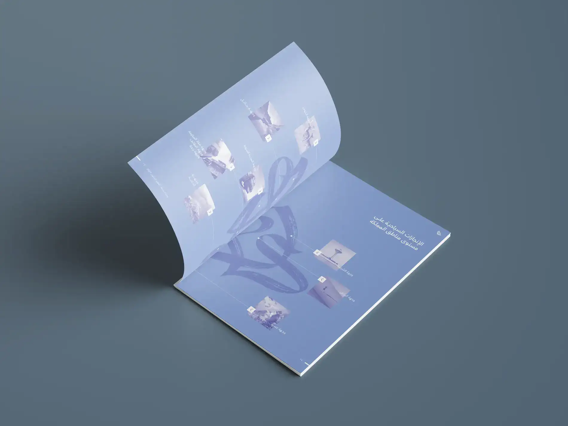
At the heart of the design is the brush device, drawn from the Ministry of Tourism’s logo. This flowing, calligraphic element appears throughout the report, unifying each section and symbolizing the Ministry’s guiding vision. By weaving the brush device into page transitions, background patterns, and accent graphics, the report maintains a cohesive brand identity while reinforcing key thematic messages.
Modern Yet Culturally Grounded Format
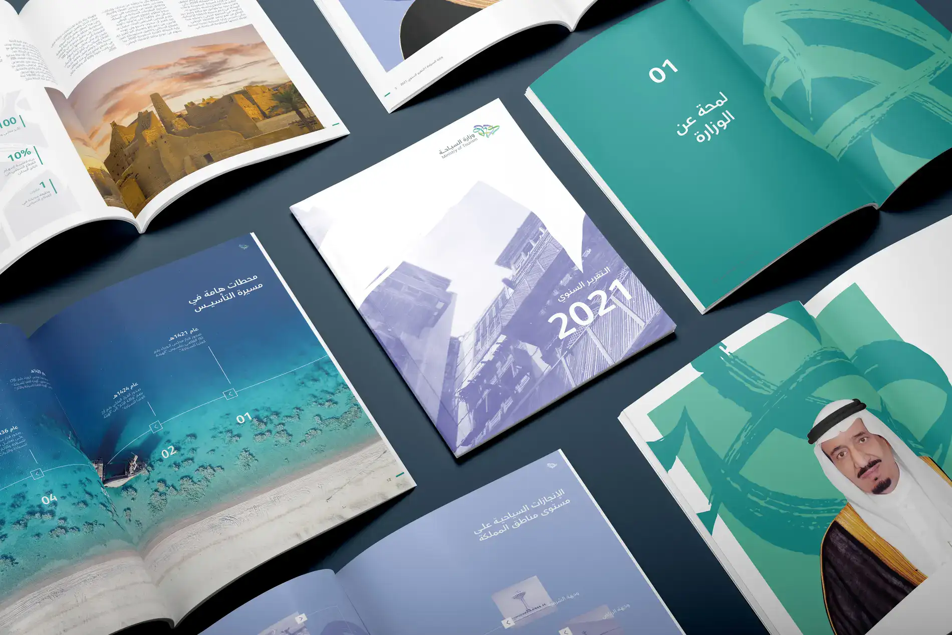
Like a gallery of Saudi experiences, the report uses dynamic page layouts to invite readers on a journey—merging text, visuals, and the brush device to capture the Ministry’s strategic objectives. From the streamlined table of contents to final conclusions, every design element works together to convey credibility, authenticity, and forward-thinking.
Clarity Through Clean Layout & Infographics
Each spread combines clear typography, striking infographics, and color-coded sections to organize complex data. Charts and numeric highlights illustrate tourism milestones, investments, and initiatives, guiding readers effortlessly through the Ministry’s achievements. The structured layout ensures easy navigation, bringing important information to the forefront while maintaining a polished, professional tone.
Consistency Across All Touchpoints
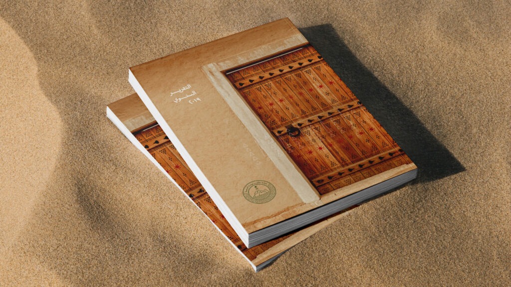
By maintaining a uniform color palette, typography, and brush device motif, the Ministry of Tourism’s brand identity is consistently reinforced. Whether in digital or print format, the annual report’s cohesive style highlights the Ministry’s dedication to excellence and storytelling.
Updated Daily


