Visual Identity & Color Palette
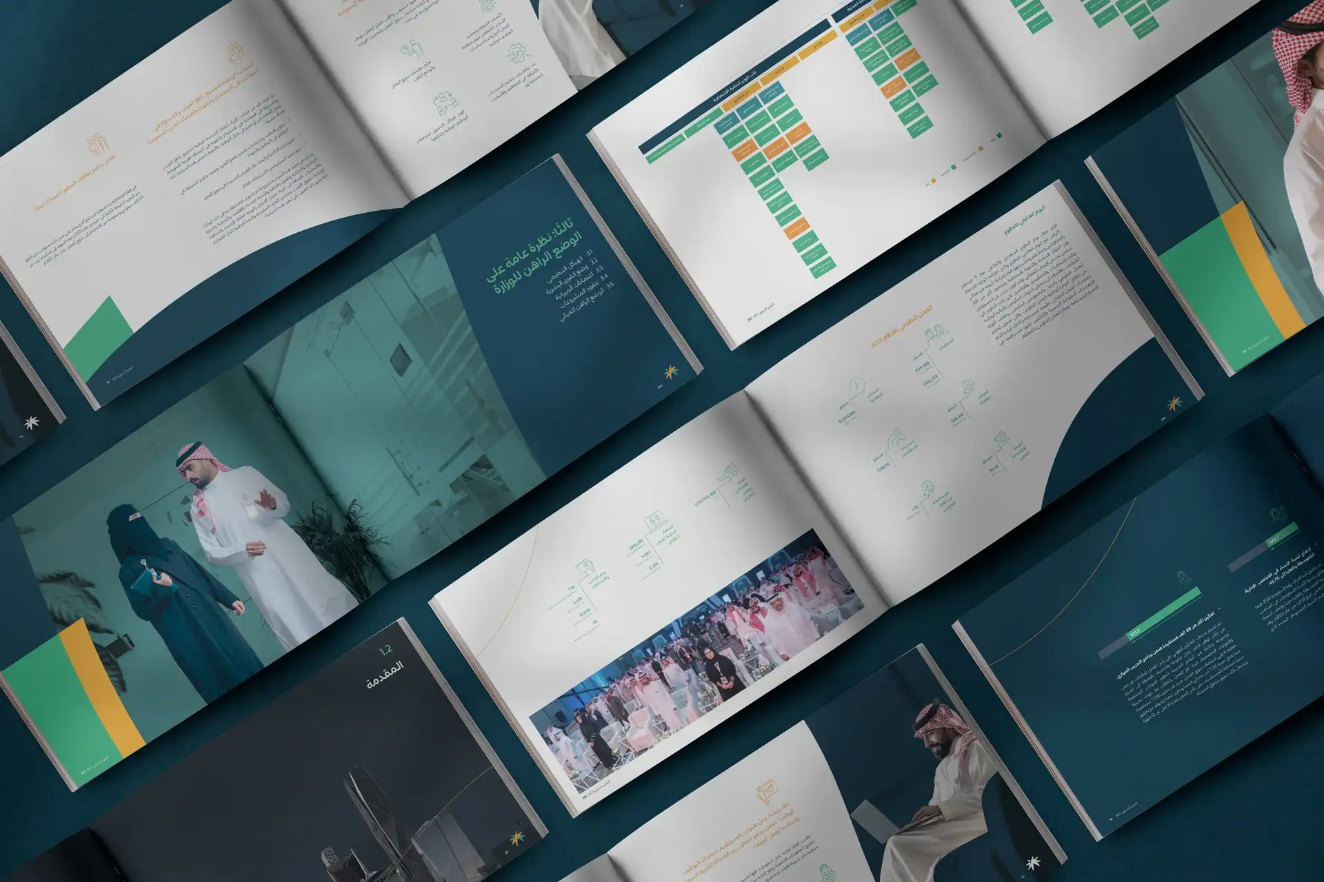
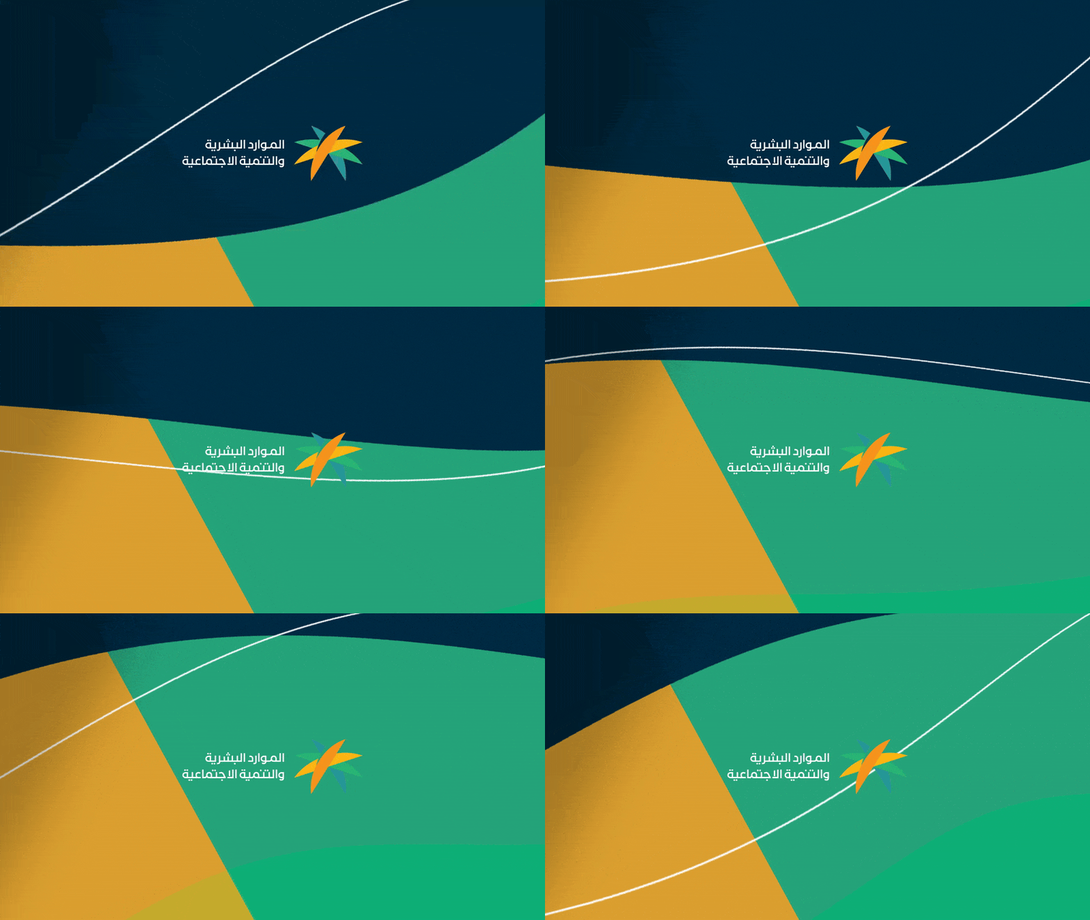
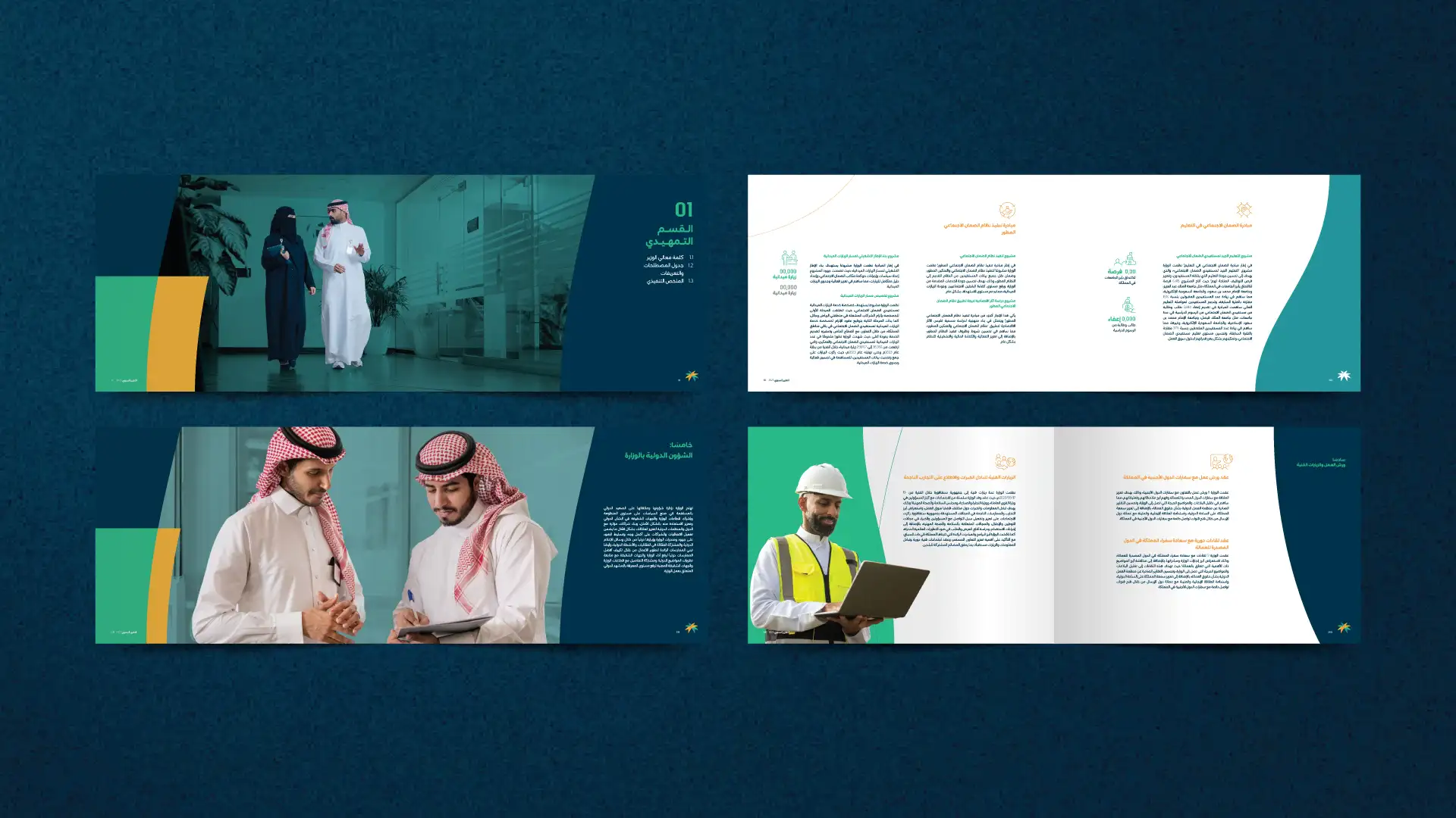
A dynamic mix of deep blues, warm gold, and fresh greens sets the tone for the HRSD Annual Report. These colors align with the organization’s dedication to advancing social welfare and enhancing workforce empowerment. The palette strikes a balance between professionalism and approachability, mirroring HRSD’s dual focus on policy leadership and community engagement.

Structured Layout & Grids
While the wavy lines bring softness and movement, the underlying grid system ensures clarity and coherence across each spread. This balance between organic shapes and structured grids simplifies the presentation of complex data—workforce statistics, social program highlights, and policy outcomes—so readers can find information quickly and intuitively.
Photography & Illustrations
Strategic use of people-focused imagery emphasizes HRSD’s human-centric mission: uplifting citizens, fostering inclusive workplaces, and strengthening communities. Illustrations and icons further support the data narratives, tying back to the wavy and shape devices for a cohesive brand story.
Visual Flow & Reader Engagement
Each section begins with a distinct wave-inspired device or shape, setting the stage for that chapter’s content. These design cues underscore progress and forward momentum, inviting readers on a journey through HRSD’s achievements. Infographics are positioned to follow the curves, creating a smooth reading experience and encouraging easy navigation
Consistency Across All Touchpoints
By consistently applying wavy lines, shape devices, and color blocks, the HRSD Annual Report maintains a unified look across both print and digital formats. This design continuity ensures that every aspect of the report—from policy overviews to success stories—reflects the Ministry’s commitment to innovation, inclusivity, and social impact.
Updated Daily

