OIL
SUNSTAINABILITY
PROGRAM

OSP was created to reveal and make a sea of opportunities and applications for Hydrocarbons globally as a competitive energy source, both from an economic and an environmental point of view.
The concept of energy equilibrium – combining different energy sources in the most sustainable way possible – inspired a graphic premise: to restore what is consumed, return what is generated, and regenerate energy in a continuous cycle.
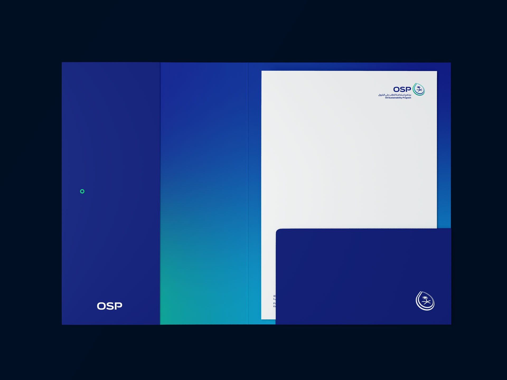
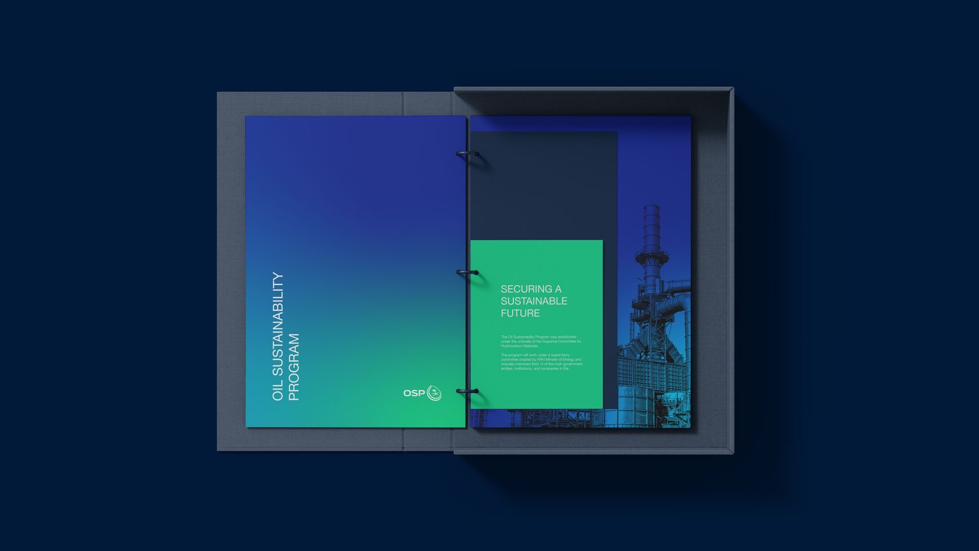
It is represented within the logo by a typographic gesture. The color gradient explains the sector’s location: from blue for gas to green for sustainability.
Scope
- Brand Strategy
- Brand Build

Primary Colors
Midnight Blue
0A1F8F
Deep Sky Blue
#00A7E1
Spring Green
#00CE7C
Teal
#008996
Fonts
Helvetica Neue LT Arabic
A B C D E F G H I J K L M N O P Q R S T U V W X Y Z
a b c d e f g h i j k l m n o p q r s t u v w x y z
0 1 2 3 4 5 6 7 8 9
A B C D E F G H I J K L M N O P Q R S T U V W X Y Z
a b c d e f g h i j k l m n o p q r s t u v w x y z
0 1 2 3 4 5 6 7 8 9


