Adaptable Minimalism
Authority Meets Clarity

At TPC–Target Partners Capital, we’re dedicated to empowering businesses with thorough compliance and governance solutions. Our new brand identity reflects the journey toward integrity, objectivity, and competence—values that have shaped our decades of collective experience in corporate advisory. Below, we dive into the brand emblem’s rationale, the chosen design style, and our deliberate use of color and type
The Brand Emblem: Hitting the Target
The logo features a minimalistic circle with a core dot—visually alluding to a target. This emblem represents:
Commitment to precision
We help clients navigate the ever-changing regulatory landscape with pinpoint accuracy.
Goal-Oriented Vision
The dot in the center symbolizes our single-minded focus on compliance success
Pathway and Direction
The concentric design implies constant movement and adaptability, reflecting TPC’s evolving approach to serving client needs
Design Style: Adaptable Minimalism
TPC’s aesthetic embraces adaptable minimalism:
- Simplicity: Sharp, clean lines create a sense of authority and knowledge, reinforcing TPC’s expertise.
- Balance: Symmetrical layouts mirror the ethos of objectivity and fairness—we aim to offer gold-standard solutions.
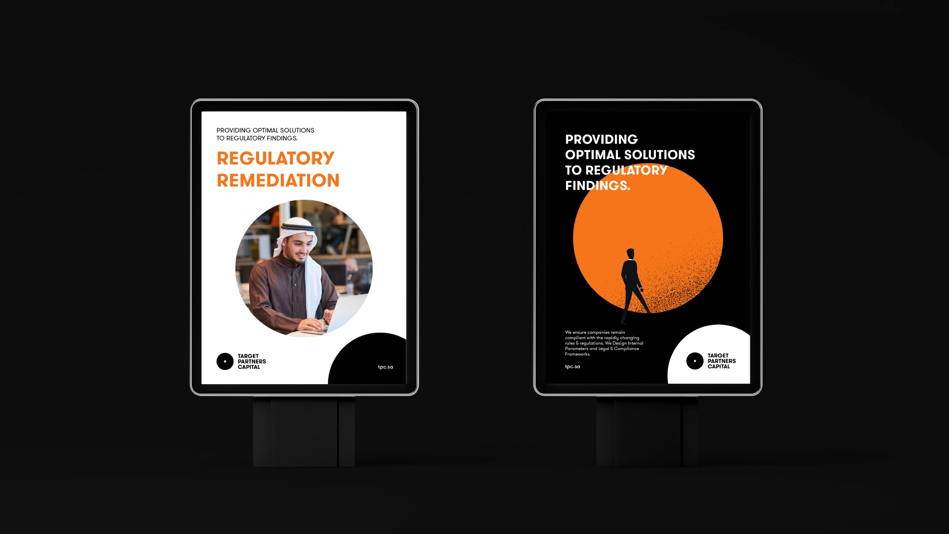
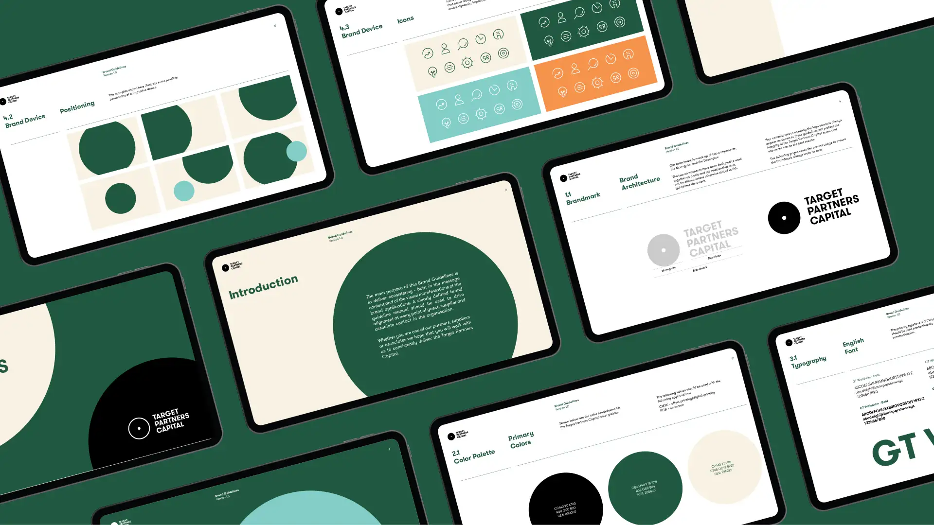
- Versatility: The emblem and text lockup adjust effortlessly across materials—from web to print—emphasizing our broad suite of offerings.


